Components
Speed your workflow with the reusable power of components.
A component is a layer or group of layers that can be reused multiple times across files. This can help you maintain consistency across a group of designs.
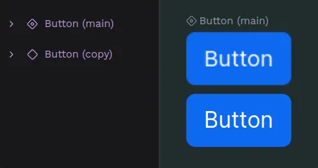
A component consists of two elements:
- Main component: The original source of truth. It defines the core properties of the component.
- Component copy (also known as instance): A duplicate of the main component that inherits its properties.
All component copies used in a file are linked in a way that updates made to the Main component can reflect in their component copies. You can override properties for component copies, so that you can manage singularities while maintaining properties in common.
Create components
Create a component
- Select a layer or a group of them.
- Press Ctrl + K or right click and select the option “Create component” at the layer menu.
Duplicate a component
You can duplicate a component the same way you can duplicate any other layer. When duplicating a component, you are creating a component copy that will be linked to its main component.
Duplicate as main component
You can duplicate a component as a new main component from the assets sidebar. Just select the component at the library, open the menu with right click and select the option "Duplicate main".
Delete a main component
You can delete main components and its copies anytime the same way you can delete any other layer.
Deleting a main component at the viewport means deleting it at the assets library and viceversa, so be careful!
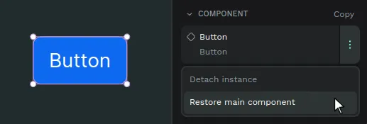
Restore a main component
If a main component has been deleted and you have access to a copy of it, you can use the copy to restore its main. There are two ways to do it:
- From the viewport menu: Select the component copy of a deleted main component, right click and press the option "Restore main component".
- From the sidebar menu: Open the sidebar menu of the component copy and press the option "Restore main component".
Find main components
Where's my component? There are ways to find main components at the assets panel and at the design viewport.
Find a main component at the assets panel
Select a main component at the viewport and then press "Show in assets panel" at the options of the right sidebar.
Find a main component at the viewport
Select a component copy and then press "Show main component" at the viewport menu or the right sidebar menu.
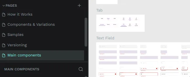
Main components page
If you find a page at a file called "Main components" this will probably mean that the file had assets with the previous components system and has been migrated to the current components system. The previous system didn't have the components as layers at the design file, only at the assets library, so when migrating a file to the new version Penpot automatically creates a page where to place all the components, grouping them using the library groups structure.
Group components
At the Components section from the Assets library, there are two ways to create groups in a components library.
- Using slashes (/): Select one component and rename it as follows: "FOLDER NAME/COMPONENT NAME". For example, "Buttons/Alert Button".
- Using the "Group" option: Select one or more components at the Assets library, right click to show the menu and then select "Group".
Ungroup components
You can ungroup the components the same ways you can group them, via the menu option ("Ungroup" in this case) or renaming them.
Drag components to groups
One very direct way to move components between groups at the assets library is by dragging them.
Detach components
Detach a component copy to unlink it from its Main component and transform it into a group layer. Press Ctrl + Shift + K or right click and select the option “Detach instance” at the component menu.
You can also detach components in bulk by selecting several components and performing the same action.
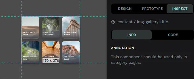
Annotate components
You can add text annotations to main components. The annotations are shown in every component copy. It is extremely useful to attach specifications that can be read at each component copy.
The annotations are also shown at the Inspect tab, as another option to improve communication between designers and developers.
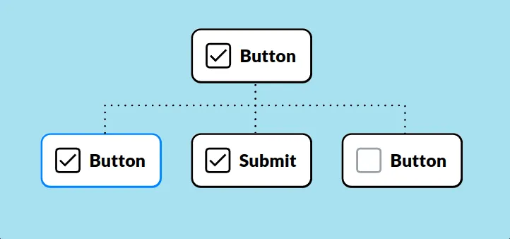
Component overrides
Main components represent the more generic information of an element in a design system. You will usually need to change specific things (like a text, a color or an icon) in a component while maintaining the inheritance of the rest of it properties. Component overrides allows you to do that in Penpot.
Overrides are modifications made in a specific copy that are not in its main component. With overrides you can keep changes at the component copies while maintaining synchronization with the Main component.
Reset overrides
Right click and select the option “Reset overrides” at the component menu to get it to the state of the Main component.
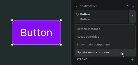
Update main from copies
You can push changes made at a component copy to a main component:
- Select a component copy that has changes that override one or more properties of its main component.
- Right click and select the option “Update main component” at the component menu. You can find this option at the viewport menu and at the sidebar menu.
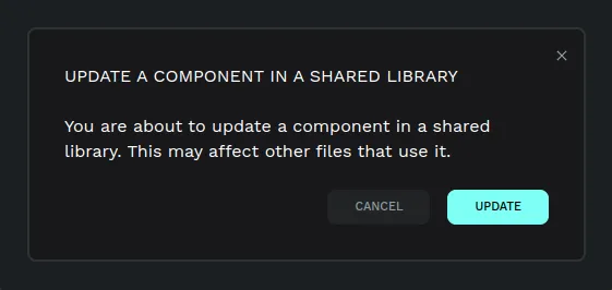
If the component that is about to be updated is located in a different file which is connected to this file as a shared library, a notification will be shown offering the options to update or dismiss.
Swap components
Penpot allows you to easily substitute component copies with other component copies.
- Select a component copy. You can not swap main components.
- At the right sidebar, press the component name to launch the swap menu.
- Choose the component you want to swap with and click on it.
Tip: The first options shown to swap a component are the ones at the same level inside the assets library, so group them properly.