Variants
Variants allow you to group similar components, such as buttons, icons, or toggles, into a single, customizable component. Rather than navigating through separate components for every possible state, size, or style, you can manage them all from one unified component using clearly defined properties.
Imagine a single button component that can switch between primary and secondary styles, active and disabled states, and small to large sizes. Useful, right? That’s the power of Variants.
Why are Variants Important?
- Cleaner libraries
Keep related designs organized in the Design viewport, Layers panel, and swap menu. Variants streamline your components into tidy, manageable sets, allowing you to retain overrides when switching between them. - Faster design workflows
Make it easier to find and select the right version by quickly switching between states or styles using simple property controls. - Better team collaboration
With variants, you can match the way states are handled in code, helping designers and developers stay in sync, fostering better collaboration between design and development teams.
Understanding variants: properties and values
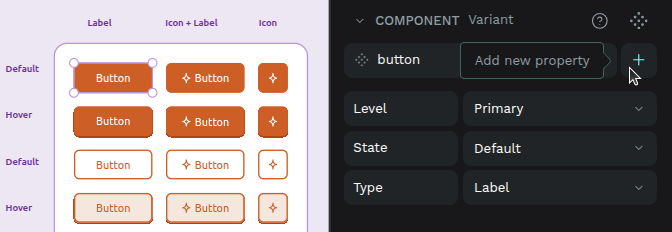
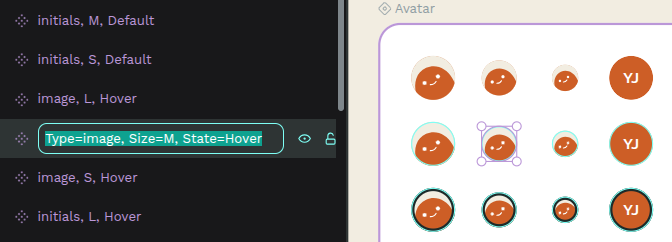
A component’s variants are organized by properties and their values.
- Properties define the dimensions that distinguish your variants (for example: Color, Size, State).
- Values are the specific options within a property (for example: Primary/Secondary, Small/Large, Default/Hover/Pressed)
Each variant is simply one unique combination of values across all properties (for example, Color=Primary + Size=Small + State=Hover).
Variants must have at least one property, and property values should be kept consistent to make switching predictable and to preserve overrides across connected layers.
Create and modify variants
Create variants
You can create variants from an existing component or from another variant:
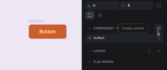
- From a component: Press Ctrl + K or right-click and select the menu option Create variant.
- From a variant: Select the variant and press Ctrl + K or right-click and select the menu option Create variant.
- By dragging: Drag a main component into an existing component with variants to add it as a new variant.
- From the Design tab (right sidebar): Select a component or a variant, open the context menu next to the component name and select the menu option Create variant.
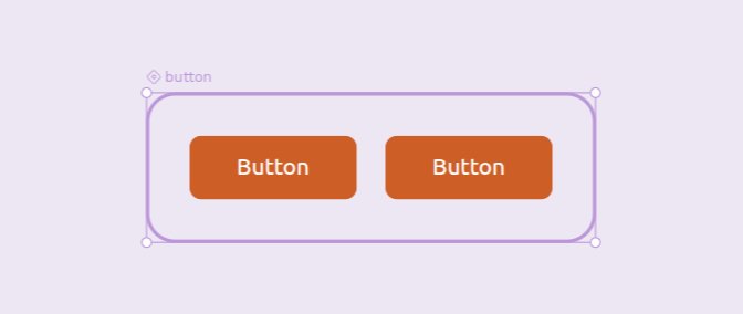
When a variant is created:
- It appears next to the original in a dedicated variant area (by default in horizontal flex layout).
- Shared layers between variants are automatically connected (connection conditions) so that overrides can be preserved.
- Variants are named using their property values (e.g., Primary / Hover).
Manage variant properties
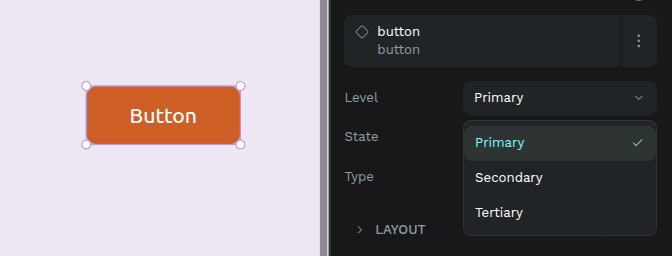
Properties are key to defining and differentiating your variants. They appear in the Design tab when a variant or component with variants is selected.
Add new properties
- From the Design tab: When the component or one of its variants is selected, you can add a new property via a menu. This property will be added to all existing variants with a default value (e.g., Value 1).
- From the Layers panel: using the formula
[property_name]=[value].
Edit properties
- From the Design tab: Select a component or a variant, then click on the property name to edit its name and/or value.
- From the Layers panel: using the formula
[property_name]=[value].
Delete properties
- From the Design tab: Select the main component (not an individual variant) and press the minus button next to the property.
- From the Layers panel: You can delete a property by editing the names of all variants so that none of them contain that property in their formula.
Variants must have at least one property. You can’t delete the last one.
When multiple variants are selected, the Design tab will show all their properties and values. If a property has different values across the selected variants, it will display “Mixed,” allowing you to override them collectively.
Delete Variants
- Select the variant, press right-click, and select the menu option Delete.
- Dragging a variant outside its component turns it into an independent component instead of deleting it.
If you delete the last variant, the entire component is removed.
Restore Variants
If you have a copy of a variant whose original was deleted, you can restore it:
- Select the variant copy, press right-click, and select the menu option Restore variant (will show if the main component still exists).
Toggle for boolean variants
When a variant property represents a boolean state, Penpot can display it as a toggle instead of a dropdown. This offers a quicker and more visual way to switch between two opposite values when working with copies.
The toggle appears in place of the property values dropdown, only when a copy is selected.
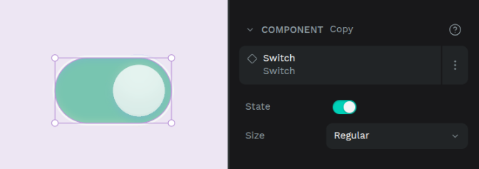
Accepted value pairs
For Penpot to recognize the property as a boolean and display the toggle, the property must be defined with exactly two opposing values. These can be any of the following pairs:
true/falseon/offyes/no
The order of the values does not matter. Penpot automatically maps them to ON and OFF states:
- ON state:
true,yes,on - OFF state:
false,no,off
Use variants
Once you have created your variants, you can place a copy of a component with variants into your design and then switch between its different versions.
From the Assets tab
Drag and drop a component with variants from the Assets tab onto the design viewport, just like you would with any other component. Once placed, you can then use its properties in the Design tab to switch to the desired variant.
From the Design tab
When a variant is selected:
- You’ll see its properties and values.
- Change one or more property values to switch to another variant.
- If your chosen combination doesn’t exist, Penpot will suggest the closest match.
Understanding overrides
A key benefit of variants is the ability to preserve overrides when you switch between them. An override is a specific change you make to a component instance that diverges from its original definition (e.g., changing text content or a specific color).
Layers between variants are considered connected if they:
- Share the same name.
- Are the same type. Rectangle, ellipse, paths, and boolean operations count as the same type.
- Have the same hierarchy level. Groups, boards, and layouts are considered equivalent.
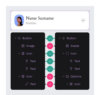
Example: If Variant 1 has a text layer named label with red color, and you change its content to Click here in an instance, then switch to Variant 2 (which also has a label text layer), the Click here content will be preserved, and Variant 2’s color will be applied.
Changing any of these (e.g., renaming or grouping a layer) breaks the connection, but reverting the change will restore it.
Bulk converting components to variants
If you already have multiple related components, you can combine them into a single component with variants:
- From Assets tab: Select components in the same group and right-click → Combine as variants.
- From viewport: Select multiple components → Right-click → Combine as variants.
- From Design tab: If conditions are met, a Combine as variants button appears on the component card.
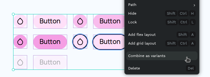
Conditions:
- Components must be on the same page.
- Components that already have variants cannot be combined.
When combined:
- A variant area is created containing all former components.
- Property names and values are generated from the component names.
Transforming Variants Back into Components
To turn a variant into an independent component:
- Drag it outside the variant area (Design viewport or Layers panel).
- Cut and paste it outside the variant area.
The new component’s name includes the original component name and the variant’s property values.